The weather has been a hot topic of conversation since we entered this ‘new normal’ of working from home. From slavishly watching reports on impending monsoons to fervent prayers for one final splash of sunshine, we’ve been hooked.
This puts the weather presenter under pressure. In their 120 seconds of airtime, they need to clearly and succinctly share a significant amount of information, some of it relatively technical. Their audience will be diverse, with a range of different agendas and interests, yet have no way of providing feedback on . Oh, and they need to do this day in, day out so keeping it fresh and engaging is important. A tough gig for any presenter.
So, what can we learn from weather presenters when it comes to flexing to a world of virtual presentations? A lot…
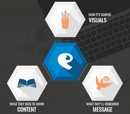
Weather presenters are able to share a vast amount of information in a short period of time because they build their audience engagement on three key presentation facets:
These same pillars are what make virtual presentations succeed. Equally, when one goes missing or isn’t fully thought through, communication suffers.
HOW IT PLAYS OUT…
Message – Each and every weather forecast starts and finishes with the big message – it’s either going to be rainy, sunny, changeable… Whatever the forecast, the message is delivered in such a way that that the audience knows how the weather is going to impact them (and whether packing an umbrella will prove to be a good idea).
Content – The message is supported by a level of content that explains why the weather is behaving in a particular way. Meteorology is a complex science but the presenter never falls into the trap of showing off how much they know. Each nugget of content is there to add sufficient context to support the message. No more, no less.
Visuals – Another important opportunity to communicate the key message rather than getting bogged down in the detail. Complex graphics of isobars and other meteorological clutter are eschewed for simple icons to help communicate the message to the audience. They are the dictionary definition of valuable visuals – they punctuate the content being shared and reinforce the message.
REMOTE READY REVISITED POINTERS
Every presentation should be built on these three pillars. Remote presentations just up the ante – the opportunity for audiences to disengage is higher than ever and, with a lack of feedback, presenters can fall into the trap of over compensating and sharing too much information (leading, inevitably, to Death by PowerPoint).
Top 3 Actions:
- Check you have a clear message – do you know what you want you want your audience to remember/do after the presentation?
- Identify the content you could you lose without impacting your message and either remove or add to a follow up document (see ‘Sustain’ for more context)
- Wherever possible, simplify your visuals so that they punctuate your delivery rather than dictating it.
BONUS POINTS:
Which weather forecast do you watch most intently – local or national?
Chances are you’re more interested in the weather that is going to impact you. Factor this into your planning and ensure that, wherever possible, your content connects with a specifically targeted audience rather than providing a generic overview. The net result will be much greater value for you and your audience.
KISS
Weather presenters share a vast amount of information in 120 seconds….so do you really need a whole hour to present your information? Keep your remote presentations short and sweet (sub 30 minutes, ideally) – your audience will be forever in your debt (and are more likely to respond in the way you want them to!)
FURTHER READING
Focus on your Audience – the ‘Connect’ phase – click here
Keeping the Conversation Going – the ‘Sustain’ phase – click here
Remote Presenting Best Practice Infographic – click here
To keep people on the straight and narrow, we’ll continue to shine a light on some of the Remote Presenting myths that have circulated across the web over the last six months. Next up – technology (and why that fancy new Zoom feature is not the panacea to poor presentation prep).
In the meantime, please share this information across your teams – between us, as a community of presenters, we can ensure that businesses do not fall back into the bad habits of old.


